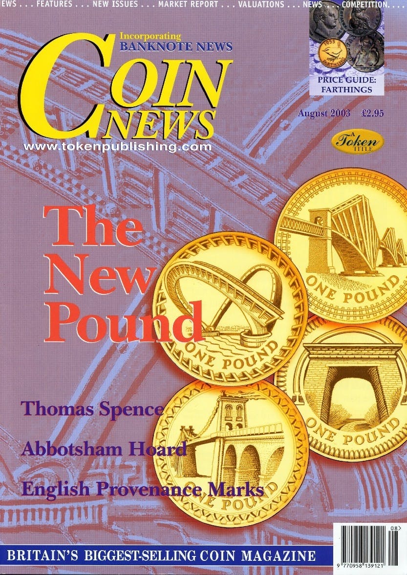
Building Bridges
Volume 40, Number 8, August 2003
The Royal Mint has unveiled a new look for the pound in our pocket, the new series of £1 coins will again represent the four constituent nations of the United Kingdom this time using bridges as the symbols on the reverse. This is the third pictorial series on the £1 coins reverse the first being the "Floral" designs (used between 1984 and 1987 and again between 1989 and 1992), and the second being "Heraldry" (used between 1994 and 1997 and then repeated between 1999 and 2002). During the intervening years, and in 2003, designs representing the whole of the United Kingdom were employed. The use of bridges is quite a leap for the Royal Mint, going away as it does from the more traditional images usually associated with our currency, and it is bound to cause some controversy amongst both collectors and the public (change always does!) but is such controversy justified? Certainly it is true that our coinage seems to be “themed” with images and symbols that reflect our history and traditions being to the fore – the Tudor Rose, the Prince of Wales’ Feathers, Britannia, the heraldic Lion, the Thistle et al and the pound coin has reflected this with its designs up until now. Admittedly there have been some distinctly non-traditional designs when it came to the commemoratives (the Marconi and DNA £2 coins, the Library, NHS and Women’s Movement 50pences to name but a few) but it was always accepted that they were “one-offs”, struck in one year to commemorate one event and they were not part of a series in the same way the more traditional £1 coins had been. These new designs are surely a complete break from the theme aren’t they? Just what is it that the Royal Mint is planning to do? Are they preparing us for another, far bigger, break from our well-known, indeed beloved coinage? After all bridges and architecture is a central and important theme on the Euro notes, are these new designs produced to tie in with them? Is something afoot? It might be, but my guess is that the unveiling of these striking new coins owes far more to the Royal Mint’s constant efforts to modernise whilst remaining within the necessary limits demanded by public and collectors alike than to anything else. After all whilst this might seem like a break from tradition is isn’t really – the first break in our modern coinage came with the introduction of the radical but now widely praised and certainly accepted £2 coin design – where does that fit with the rest of the series? Well it doesn’t but nor is it out of place, it is a design that is neither traditional nor too modern and slots in nicely with the other denominations. Indeed it fits in far better that other coins have done in the past – you only have to look at such oddities as the wren on the farthing or the thrift on the brass threepenny bit to realise that our coinage hasn’t always been quite as traditional as you might have first thought. So I am sure it will be with these new designs, they aren’t part of the “theme” but curiously nor are they completely divorced from it
Order Back Issue
You can order this item as a back issue, simply click the button below to add it to your shopping basket.

